The master’s soul, set in type
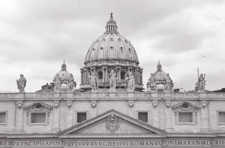
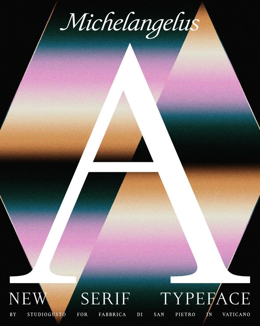
A timeless serif, rooted in the spirit and grace of the San Pietro Basilica and the Pietà, drawn from the handwriting of a Renaissance master — Michelangelo.
The greatest works of the Renaissance artists followed the rules of clear proportions. Their universal beauty made them easy to comprehend and egalitarian. Similarly, the Michelangelus font is made for clear communication, it keeps the natural flow of writing and turns thoughts into words, giving each one weight and importance.
Renaissance ink, modern rendition
Sublime proportion, rhythm and harmony: measured by the artist’s eye, translated into digital system.
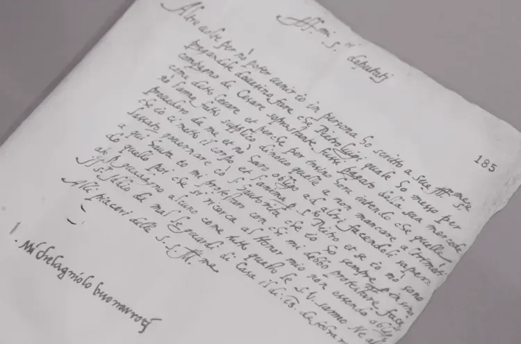
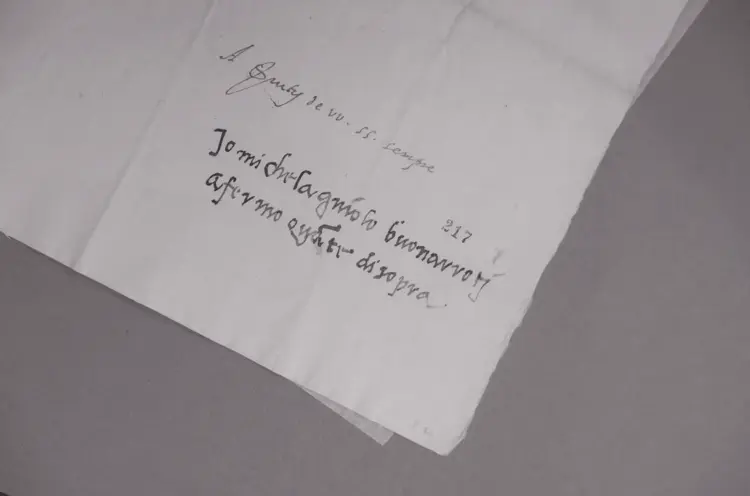
Michelangelo’s exceptional calligraphy was led by unmistakable intuition. A digital typeface required the opposite — every curve, line and serif has to be designed with mathematical precision, consistent across 455 glyphs, keeping the beauty of the maestros’ style.
From the personal voice to monumental presence
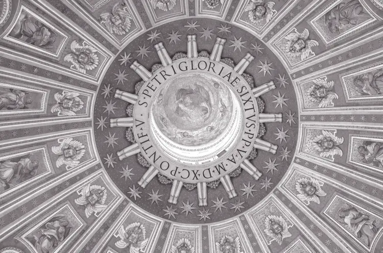
We closely studied over 300 manuscripts by Michelangelo. To design the lowercase letters we entered the artist’s private world, studying his handwriting and the curves of his signature. Zooming out from the page to his only autograph on Pieta and inscription on St. Peter’s dome, we shaped the uppercase letters, tracing the bond between the artist and his greatest work. A more resonant voice in capital letters, marking his personality and his work of art.